Urbana Laser Hair Removal Salon
DESIGN CHALLENGE AND DESIGN IDEAS
The brief for Urbana laser hair-removal clinic was to create a space unlike anything on the market. The objectives were to showcase Urbana brand with an original design; the utmost importance placed on how the customer would feel in the space. Layout was crucial as the site was long and narrow with limited natural light. There were huge functional requirements so every inch of the space needed to be carefully considered to maximise on functionality. Ventilation and extraction were a crucial consideration and needed to be housed seamlessly not to detract from the experience. KLD proposed a polished industrial design with innovative use of materials and strong focus on details to appeal to diverse clientele. Streamlined fixtures and fittings created a clean, high end look. The client wanted to ensure that the customer felt at ease throughout, but also inspired by luxurious and well-presented space.
HOW THE BRIEF WAS MET
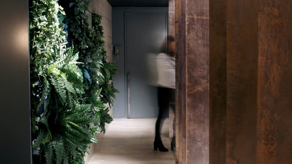
The design included seven therapy rooms, two consultation rooms, a reception, male and female waiting areas and retail display, two wax rooms, toilets, staff area and offices. A detailed design portrayed creativity and design excellence throughout. Materials used included corten steel, marble, concrete, brass and oak. Lush planting was used to soften the space with delicate lighting to contrast the structured, architectural design. Several design features make this particularly exemplary. Each therapy room was a highly considered user experience for customers as well as therapists. Materials were important to work with the wax and medical standard laser machines. Everything used was durable with longevity. Ducting, storage and bins were built behind joinery, concealed by timber but accessible to the therapist. A sink in the hallway was hidden behind a timber clad wall, which allowed the therapist to discreetly dispose of laser machine waste. Due to high temperatures of the laser machinery, a suitable extraction system had to be incorporated into each room. In their previous premises therapists would clean the floors several times a day to remove settling hairs. A new extraction system was researched and incorporated to draw the hair in the atmosphere out. To accentuate the ceilings and achieve a seamless look, all full height doors and walls were painted the same colour in order to read as one. Key features included a bespoke concrete and marble reception desk and custom concrete panelling (designed by us and produced by Concrete Design Solutions, incorporating sustainable Ecocem cement products) bespoke joinery and a corten steel shop front. Architecturally every detail lined up, resulting in a highly considered appearance. The existing build had two steps past the reception level, the new design raised these up higher and added in a lit recessed handrail for aided accessibility upstairs. Outside therapy rooms, reading nooks were designed for therapists to update clients’ notes while the client prepared for their treatment. Mirror was also used to make the space appear larger and brighter. To ensure customers were afforded ultimate discretion, a separate male and female waiting area was created. We designed illuminated signage for privacy in each therapy room to illustrate when occupied. Polished plaster was used instead of a rough render in keeping with the desired polished industrial look.

