Safe Events
DESIGN CHALLENGE AND DESIGN IDEAS
The key challenge for this project was to take a very dry and niche subject (event safety) and communicate its value and importance in an interesting and memorable way. Event Safety is very much about process and planning so we were challenged in how to make the website content visual and interactive. Event safety is something every event organiser needs to consider and yet it's not an easy subject to capture and hold interest. We needed to communicate just enough to convey our client's expertise but not too much to overload the visitor with excess information.
HOW THE BRIEF WAS MET
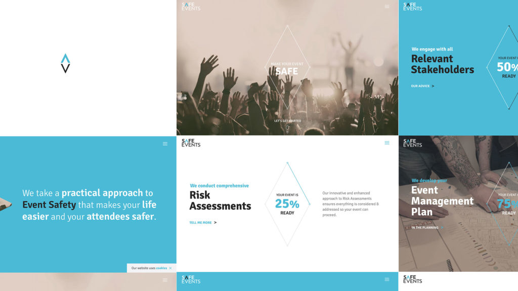
We decided to start the user experience with an animated play on the logo's brandmark in the opening panel of the homepage (https://www.safeevents.ie). We created an animated flow of 4 key things that need to be considered in relation to safety when planning an event. We connected the percentage increase to the user scroll to make the experience interactive and engaging. By using this innovative approach, the visitor can quickly see the key steps involved in event safety without needing to know too much more. The steps also reinforce our client's expertise. By following the principles of progressive disclosure, each step includes a call to action linking to more information should the visitor wish to read further. You can note that this animated process works perfectly on all mobile devices. In the menu dropdown, we used this space as an opportunity to communicate what they're currently up to to show how active they are within the industry. The process page (https://www.safeevents.ie/safe-events-process) demonstrates an innovative way to make a series of steps engaging. Again, similar to the homepage, the animation of the line is influenced by the user scroll making it a more engaging and fun experience. For the approach (https://www.safeevents.ie/safe-events-approach), we want to communicate high level info first to maintain a clean uncluttered UI. Behind each piece of information is more detail if required. We achieved this by incorporating smart interactive effects around the various elements. When presenting the key members of the team (https://www.safeevents.ie/safe-events-team) we need to strike a balance between professionalism and approachability. We ensured the branding prevailed by using black and white photography for the headshots intersspersed with blocks of blue to add colour and warmth. Again we hid the team bios behind links to maintain a clean, uncluttered user experience throughout. We also needed to communicate the value of the wider event team. We achieved this through photographs, bullet points and an interactive effect on each image to reveal further value. For the blog (https://www.safeevents.ie/blog/) we wanted to create something a little bit different by including a blog post preview on the right side of the screen when the user hovers over a blog heading on the left.

