Seamark Building Brochure
DESIGN CHALLENGE AND DESIGN IDEAS
Elmpark Green is a mixed-use campus close to Merrion Road in Dublin 4. The vast office and residential development was recently bought by US investment company Starwood Capital Group with a view to completing works on the 17.3 acre site. This included the development of the landmark building at the gateway to the site – an impressive 8-storey building originally intended as a hospital or hotel. The development would see the building repurposed as office space. We were commissioned to name the building and design the marketing collateral to promote it. After the naming process, the main challenge was to design a brochure that stood out from other marketing collateral from competing commercial office spaces being built/leased around the city.
HOW THE BRIEF WAS MET
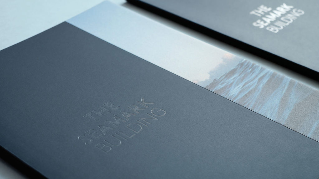
The building offers many benefits, but one of the main attractions is its panoramic views over Dublin Bay, which we wanted to reflect in its name. After much consideration, we named the building ‘The Seamark Building’ and designed a visual identity around an original sea image by photographer Gary Coyle. The building’s unique location also influenced the brochure’s paper stock. The front ‘location’ section is printed on Curious Collection Matter Goya White (which features a texture of fine sand), while the back ‘specifications’ section is printed on Arctic Volume White, a smooth matte, fully coated paper. These contrasting textures are also apparent on the brochure’s front cover, which incorporates a layered combination of Curious Collection Skin Dark Blue and Curious Collection Matter Goya White, with the building name subtly emerging in a glossy clear foil. Gary Coyle’s image features in fold-out spreads, giving the brochure a sense of space, while a colour palette of blues, ranging from aqua to navy blue, are woven throughout to complement the sea image and architectural photography. A complementary yet contrasting pairing of serif and sans-serif typefaces have been chosen for the layouts to ensure that the design is sophisticated and contemporary, mirroring the contrasting paper textures. The brochure also features a floating spine to ensure that the spreads lie flat.

