WINTER
DESIGN CHALLENGE AND DESIGN IDEAS
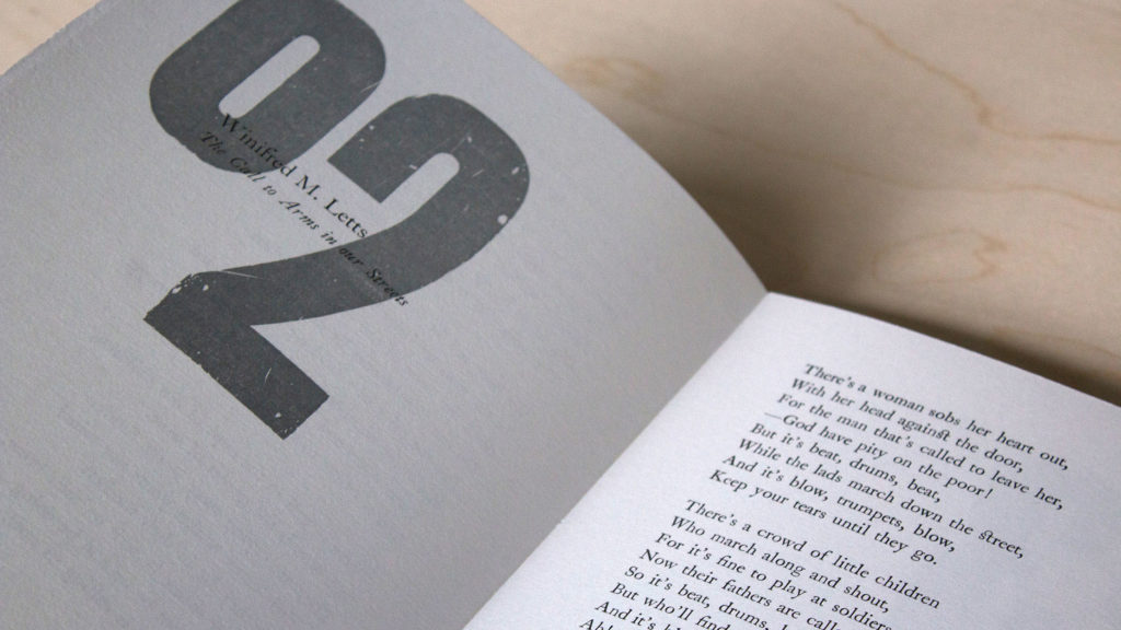
The challenge here was to bring the voices of 14 very different poets together in a cohesive manner. The audience will be extremely design and print aware and so the execution needed to be to the highest standards. The project was always focused on producing a finely printed book but perhaps there could be a secondary element that would enhance the experience for the reader. Consideration was necessary in the following areas: Type choice, typographic design, layout, composition, illustration, paper stock, letterpress printing, binding and box making.
HOW THE BRIEF WAS MET
Solution: This project was a significant undertaking for my small imprint and a great effort was made to push the book in new and interesting directions. While the codex itself is linear and not exceptional in its form, it is easy to navigate and easy to digest. The accompanying portfolio of typographic prints relies on a strict grid system while simultaneously seeming free of constraint. There are essentially just three colours employed – process black, jewel silver (mixed by hand) and hues of process blue. The metal and wooden types are contempory to the subject matter, all in use during the Great War. The entire project was typeset, letterpress printed and finished by hand. From the colophon: WINTER has been designed, typeset by hand and letterpress printed by Jamie Murphy with much grateful assistance from Michael Simpson, Jordan Huysmans and Rauiri Conaty.

