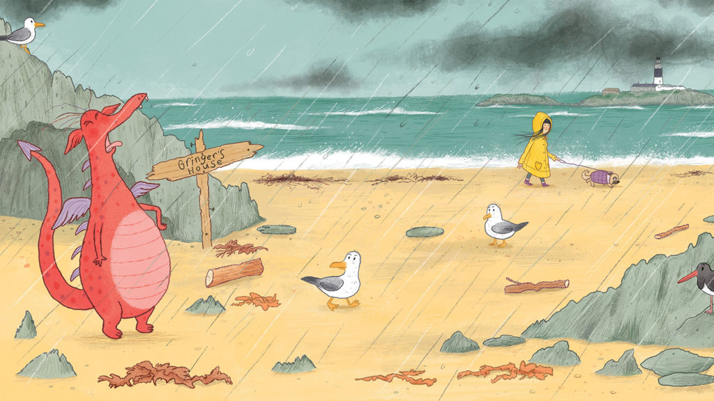
Gringer the Whinger
DESIGN CHALLENGE AND DESIGN IDEAS
"Gringer the Whinger" is a picture book which will publish in October with a small Irish publisher called Golden Key. The brief was to create the colour artwork for a picture book with sixteen spreads plus endpapers and cover. The specifics of the spreads were left very much up to me - because of the size of the publisher, there was no art director involved. The story is about a mischievous dragon called Gringer who lives by the sea and comes to pester a local family at mealtimes. The artwork needed to convey a chaotic, domestic environment with wit and humour. See below for the creative and technical challenges involved.
HOW THE BRIEF WAS MET
The brief presented certain design challenges, mainly down to the fact that it was a 16 spread picture book in which much of the story was based in the same kitchen. It was a head-scratcher at the beginning, but I managed to avoid repetitive-looking spreads by altering viewpoints and presenting the kitchen from different angles and perspectives. For a few pages and on one whole spread I ommitted the background completely so as to allow some breathing space on the page turn. I also managed to avoid a visually boring experience by creating three distinct colour palettes: one palette for the beach scene, one palette for outside and one palette for the kitchen, which all needed to chime together. Character Design was an obvious challenge of this project. The text called for at least six characters, which is a lot for a picture book. All characters needed to look like a generic Irish family, yet distinctive and appealing in their design and execution. I went through a few iterations of Gringer the Dragon until he was right: just friendly and tubby enough. Characters also needed to appear consistently themselves throughout each and every spread, which is always a challenge. The King Charles dog was on my part and was not mentioned in the text. I added her to act as a kind of foil for the dragon and as a funny side story, and so that the visuals in themselves did not become tedious or repetitive. The lettering on the cover is hand-drawn. I decided on a cream background that would allow the characters to pop and breathe and added a purple banner on the lefthand side to give some extra colour. The endpapers are included in the submission, which work well in contrast to title pages that follow it in the book. All of the artwork is created in Photoshop with the aim of making it seem hand-drawn.

