DoDublin Rebrand
DESIGN CHALLENGE AND DESIGN IDEAS
Dublin Sightseeing has a great product portfolio and a solid reputation for providing tours and travel services in and around Dublin. However, the market has become more competitive and audiences’ sightseeing needs and behaviours are changing. The challenges were to relook at Dublin Sightseeing and its engagement with its audiences, grow market share by maximising cross-selling opportunities, and regain its position as the “authentic Dublin” sightseeing company. Visitor expectations have evolved, as people now seek experiences that provide a real sense of place. Therefore, it was vital to highlight that Dublin Sightseeing is run by a passionate team of proud Dubliners, knowledgeable about their city and eager to share that knowledge with the world.
HOW THE BRIEF WAS MET
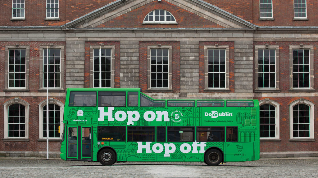
Dublin Sightseeing’s key USP is having the best and most knowledgeable drivers and guides in the city, who deliver tours with authentic local charm and Dublin wit. This led us to define the positioning as “The Dubliner’s Guide to Dublin”. The name of the brand needed to become more active and memorable – less about a generic sightseeing service, and more about what it enables travellers to do. Changing from Dublin Sightseeing to DoDublin provided clear standout from the other two sightseeing operators, and future-proof the organisation to changes in technology, visitor behaviour and category extensions down the line. It gives visitors a memorable brand to engage with in an industry where Trip Advisor reviews are an important factor. We created a brand that could house a wide portfolio of distinct but related products; that would be the authority on transport and guided tours, for national and international visitors alike. The core visual element of the new identity is a ‘D’, in which the counterform resembles an eye and a travel route. The D becomes a holding shape for icons representing the different tours on offer, creating a visually recognisable suite of tours for the consumer. The visual expression and messaging promise a unique insight on the city, its culture and people, and a real experience that is never scripted. Business cards featured staff members area of local expertise rather that job titles. The bus drivers’ favourite parts of the tour were featured on posters and the backs of the buses. Promotional merchandising was created to engage the increased numbers of visitors during Ireland’s Six Nations games, using a distinct Dublin tone of voice. For the trade launch, the hospitality sector was treated to a mini-tour, enabling them to meet the drivers and hear DoDublin's voice for themselves.

