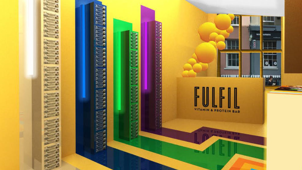
Fulfil pop up shop
DESIGN CHALLENGE AND DESIGN IDEAS
The challenge: To transform an office space and entrance hallway of an unused building and an adjoining alleyway on South William Street into an eyecatching pop-up shop & café which would operate for 4 days, promote the sale of 4 new Fulfil bar flavours, 4 existing flavours, FroYo and coffee. The Fulfil brand is young and vibrant with a clean, simple aesthetic and we were tasked with creating a space which reflected this. We had 3 weeks and carte blanch to design, build and fit out the spaces. Main challenges: Tight timeline, dilapidation to building interior & budget. Budget didn't allow for a full interior refurb so we created new stud walls within the space which were sheeted and vinyl wrapped. The floors were treated in the same way. We also created new ceilings, finished in white fabric and lit from above to brighten the space.
HOW THE BRIEF WAS MET
We undertook graphic, furniture and interior design. We used Fulfil's yellow brand colour on the floors and walls of the shop and on the walls of the café. We played with the client's multicolour pinstripe graphic, using it to create focal points on the café back wall, walls and front door of the entrance hall and as a directional tool on the floor of the hall and shop. The pinstripe led shoppers along the entrance hall and into the shop. Inside the shop the pinstripe broke up into separate colour stripes, some of which led to a display plinth and shelf unit carrying the original 4 flavours. We used 4 wider stripes of colour on the floor and walls of the shop to connect display plinths and shelves carrying the 4 new Fulfil flavours. The shop space was relatively small so all display shelving was designed to be tall and skinny. Because we created new walls within the entrance hall and shop space we were able to run all power cables behind the studwork, allowing for a clean uncluttered aesthetic. We used opal perspex display plinths which were vinyl wrapped using elements of Fulfil's branding and internally lit. We used colour coded stick lights on the shelving to highlight the product. We created sloped ceilings in the entrance hall and shop and carried this angled look through to the design of the service counters in the shop and café and on the main sign over the entrance to the café. We also used carried the angled look through to the design of high counters for the café but due to budget constraints this idea was replaced using rental pod tables which we branded. To attract passers by we created a balloon installation – a cluster of balloons which “grew” out of an interior shop wall, travelled though the shop window and up the external wall of the building up to the 3rd floor. We transformed the alleyway using artificial grass on the ground and yellow fabric walls. We created a branded back wall at the end of the café which was built using 2 overlapping, offset walls, allowing for staff to access a coffee machine positioned back of house.

